Using Visuals To Help Us See
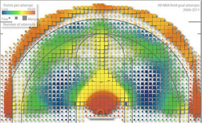
 Earlier this week I was momentarily mesmerized by this graphic included in a short piece that appeared on Slate’s culture blog. The image appeared atop an article by David Haglund called “What Geography Can Teach Us About Basketball,” and the piece alludes to yet another way increasingly sophisticated analytical tools have become part of how sports are studied as well as the basis for strategy.
The picture represents a map of shots taken in the NBA over the previous five seasons (click to enlarge). Darker cells represent more shots attempted, and the color-coding shows the relative efficiency of the shots. Cells yielding the most points per shot are shaded red and orange, while the least “potent” cells are shaded blue and violet.
The chart was devised by a geography professor named Kirk Goldsberry using techniques he’d applied to study things like traffic patterns or how access to nutritional foods can differ depending on where someone lives. The study is titled “Court Vision: New Visual and Spatial Analytics for the NBA” and was presented this week at the Sloan Sports Analytics Conference.
As Haglund points out in his brief summary of Goldsberry’s work, the map shows what most basketball fans already knew, mainly that the most point-rich areas of the court are right around the basket and just outside the three-point line. That yellow strip up the middle also shows how players tend to do better shooting straight on than from either side.
 The study includes images plotting out the shooting for particular players, and Haglund additionally asked Goldsberry to show him what Boston Celtics guard Rajon Rondo’s map looked like. The image plotting out Rondo’s shots appears to the left (again, click to enlarge) and curiously shows how when it comes to three-pointers Rondo has a kind of “sweet spot” there to the left of center where he is much more effective than he is when shooting from the right side of the court. Notice how that halo around the hoop leans to the left for Rondo, too, which is interesting since Rondo is in fact right-handed.
Reading the study and looking at these maps got me thinking about some of the analytical tools that have been used to track online poker play such as PokerTracker and Hold’em Manager and how they, too, can yield interesting information about patterns of play both generally and individually.
Once upon a time I was studying my PokerTracker stats fairly intently in an effort to learn more about what was working and what was not in my play. Early on I saw and became accustomed to the fact that everyone tended to make more money from the button and late position, as well as to lose the most from the blinds. And, of course, premium hands routinely yielded the most profit, too -- not just for me but for everyone else.
I recall noticing a few idiosyncracies for me as well, things that might be said to have corresponded to Rondo’s “sweet spot” where he hits a high percentage of threes as well as those rough areas where he misses the most. I remember once realizing I was probably losing more than I should with small pocket pairs. Overlaying my stats with everyone else’s would’ve told me more specifically whether I was outside the norm in that regard, although I don’t remember pursuing my study far enough to make any conclusions.
Not really tracking my play much at all anymore, I’m afraid, other than to note wins and losses in my little black book. Definitely worth doing, though, for those who are serious about the game and looking to improve. Just as I think this sort of analysis could probably benefit NBA players, too. Have to imagine Rondo, now in his sixth year in the league, has been shown his map, too, yes? And if he has maybe he will start passing up shots from those blue areas where he’s often cool, opting instead for the hot spots in red.
Where are your red areas or “sweet spots” at the poker table -- that is, spots that may uniquely fit with your skill set to bring you greater profit than most? And which areas make you more blue than most?
Labels: *shots in the dark, Hold'em Manager, PokerTracker, Slate


0 Comments:
Post a Comment
<< Home